An Expanded Field of Play:
How to Read a Visual Poem
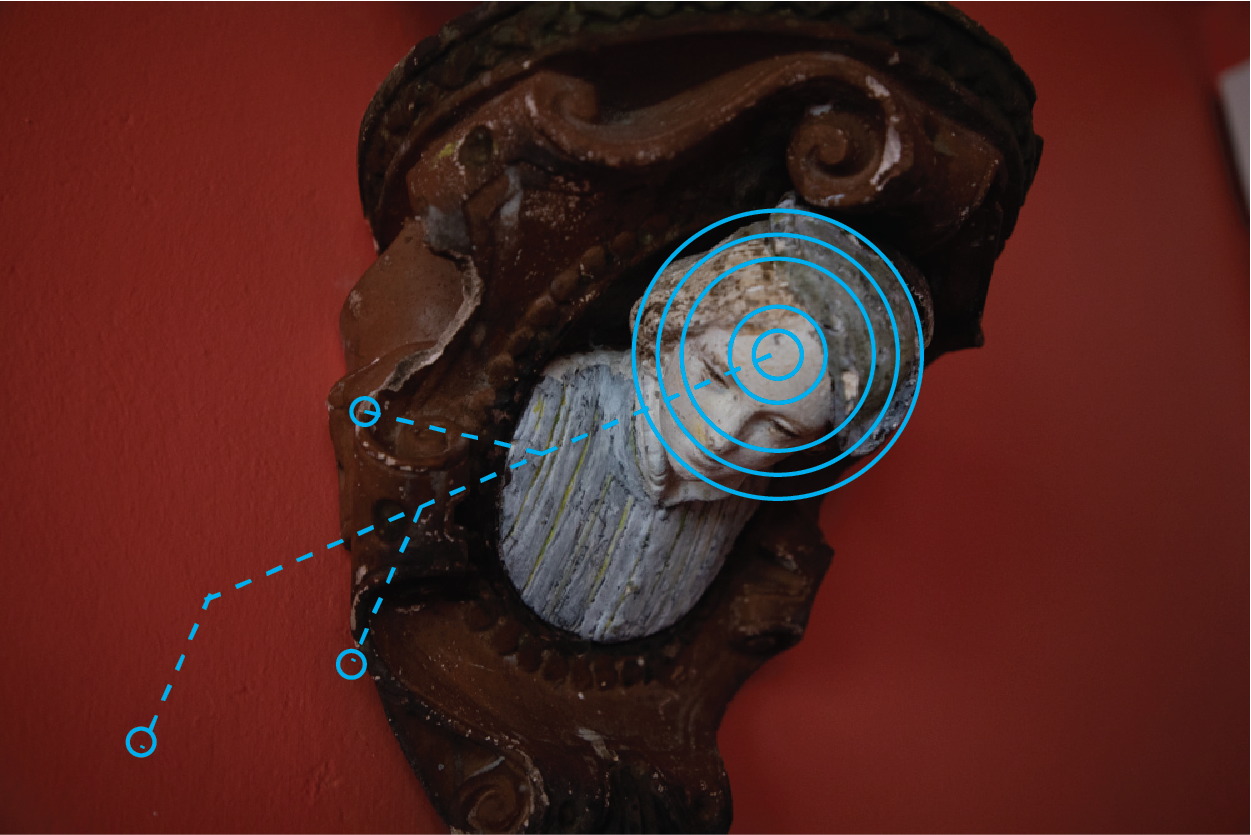
Intro
This primer is intended to support the teacher, the reader, or the artist of visual poetry. It is also a companion to the book Games for Children by Keith S. Wilson. One need not own or read that book for this guide to be of use.
What is a visual poem? A working definition:
visual poem – a poem which especially depends on being seen for its meaning
My goal is to be as clear and comprehensive as I can while remaining brief. The above definition is the first example of this philosophy. Bolded below are all the words which, themselves, might need defining:
a poem which especially depends on being seen for its expression
What, for instance, does it mean to especially depend on visuals? I leave many (nearly all!) of the answers up to you.
Imagine you want to explore the wilderness. This is a guided path. If you are uncertain about venturing forth alone, it will familiarize you with the landscape. If you never leave the path, you will miss nearly everything.
And so we go!
Reading Order
“I rejected the ordinary and the extraordinary, because / those are rungs / one learns how to climb. I do not need a ladder to reach / the sky.” – “Further Adventures in Monochrome,” John Yau
If one question remains evergreen when it comes to visual poetry, it is: “What order am I supposed to read these lines?” It’s a good question; in English, a traditional poem (that is, a text-based poem we treat as non-visual) is read left to right, top to bottom. We know to do this every time. The tradition of poetry includes a tradition of lyric comprehension—of literacy.
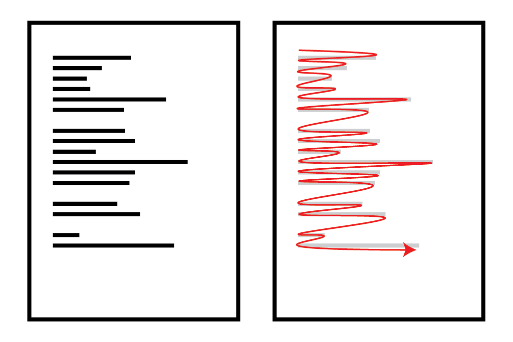
In a visual poem, other ways of reading open up. There are three broad ways to think about how to read a poem that break from the traditional order of reading lines. First, is it accessing a different tradition of “reading”? Consider: How do you decide to move your eyes in a comic book? In a painting? In a poster? The 回文詩 is a Chinese poem form that can be read both forward and backward. (For more on this form, see Emily Lee Luan’s book 回 / Return, and her essay “Notes on Reversing”).
Second, the poet may be inventing a new order of reading. Are there clues for how to read the poem? Are there arrows or numbers? Try reading a line or stanza and arbitrarily moving to another, then try a different order. Does one way of reading seem to “make sense?” If some ways of reading are perfectly grammatical, and other ways are not, this can be a sign that there is a preferred way of reading.
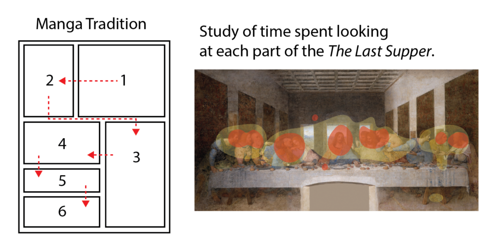
Third, the poet may be open to many or all reading orders. Or a poem may have no order, or no true order.
Why break from the tradition of left to right, top to bottom? A visual poem might resist chronology because of its interest in feeling, thoughts, and ideas—concepts that don’t necessarily adhere to “order” (these are also the traditional subject matters of lyric poems). Or, a visual poem might be interested in the narrative tradition of poetry but expresses it anew, as in DeeSoul Carson’s “Good Riddance,” which is inspired by the video game Hades. Like the video game, every path out of Hades is a path back in— nobody, not even the prince of the dead, can escape the inevitable.
Reading order can indicate many things—it can represent the mind (stream of consciousness), or a resistance to “tradition” or narrative. If the poem adopts an alternate tradition of reading, it might be in conversation with the associations of that tradition. For instance, visual art is often open to interpretation, and so too might the visual poem that is read like a painting. What is the impact of returning, over and over, to a stanza of a poem not because it repeats, but because you keep choosing to look back to it? As always, look at what the text is saying and see if it aligns with something the reading order says or allows for.
For more on reading order, see: Gestalt Grouping.
Further Examples:
- Layli Long Soldier – “Obligations 1,” “Obligations 2” (from Whereas)
- Monica Ong – “Diaspora Nova” (from Planetaria)
- Tyehimba Jess – Olio (or look up any of his contrapuntals; he also has talks on them.)
- Eugenia Leigh – “Oh I Thought You Knew, She Said, Dad Is Alive”
- Eloisa Amezcua – “Bobby v Valorie” (from Fighting Is Like a Wife)
White Space
“Poetry is a problem of form and emptiness.” – The Book of Form and Loneliness, Ruth Ozeki
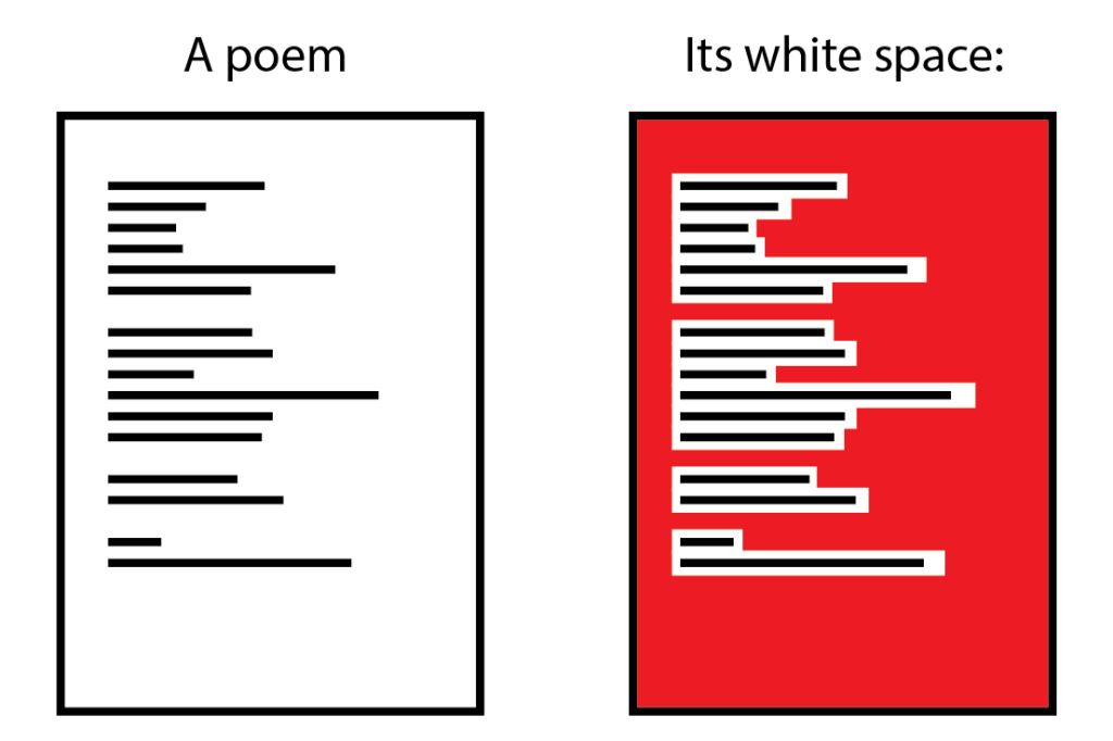
White space is the unmarked page or canvas—it is everything you don’t write on, draw on, or place image or text against. Since white space is the page itself, it can technically be any color.
White space exists in all poems on the page, but a poet traditionally has very little to no control over much of it, since the publication or press decides the formatting and layout. A short poem on a large page will have a lot of white space, no matter what the poet intends. Even so, a text-only poem can increase white space by breaking larger stanzas into smaller ones, or by increasing the distance between each stanza.
A visual poet, on the other hand, tends to actively create white space through intentional decisions about how big an image will be, or by the shape of a poem. This engagement with white space therefore foregrounds it. To see if the poet might be “working with” white space, look for poems that “don’t fill” or “don’t fit” their container. Look for poetry collections that are not conventional in their sizes or dimensions and layouts that introduce a lot of page with nothing on it.
So what does it mean? As with all forms of language, there is no one answer, and any answer depends on context. Here are some associations that could apply to white space:
Space (all the definitions of it), the field, emptiness, breath, time, absence, rhythm (be mindful of how long it takes the eye to find the next word or image), calm, focus (think of the effect of a single haiku on a large page), quiet, whiteness (since most pages and screens are white).
A poem that has no white space might feel cramped or oppressive. A poem with a lot of white space might feel airy. Or it might feel exposed. What else is the poem saying or doing that might let you know what the white space could mean?
Further Examples:
- M. NourbeSe Philip – Zong!
- Erasure poems. See: Nets by Jen Bervin or The ms of m y kin by Janet Holmes
- Sky Hopinka – Calligrams (Text installation)
- Leila Chatti – “Annunciation” (from Deluge)
- Diana Khoi Nguyen – Ghost Of
Letter Style
“Though it is commonly done, it is not right to use the same type faces for poems as for the reports of Board meetings.” – Design as Art, Bruno Munari
I am using a broad term (letter style) for two interrelated concepts: 1) font choice and 2) style of handwriting. While nearly all traditional poems are typewritten, a visual poem needn’t be, and so we can and should consider handwriting as a tool of the visual poet. Devan Murphy and Bianca Stone are two visual poets whose work engages with handwriting (and illustrations).
Fonts and handwriting share a capacity for expressiveness. This is somewhere between an art and a science. Based on their appearance alone, how do each of these font choices make you feel:
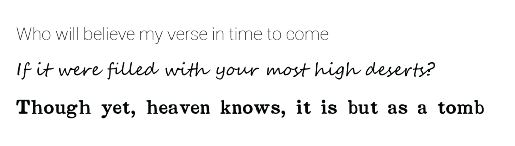
Fonts can evoke elegance, playfulness, romance, seriousness, severity, fancy, tradition, authority, motion—the list goes on. These qualities apply as well to your natural handwriting. Consider the difference in a handwritten letter that is written carefully versus hurriedly, or one written in print versus calligraphy. How might each of these make you feel? Is there something in the personality of the person you can see in their handwriting or font choice?
Think too about choices you may make when writing. WHAT IS THE EFFECT OF RESPONDING TO A TEXT MESSAGE LIKE THIS? How would you expect a whisper to be written in a comic book? What color would you choose for someone’s words if you wanted to show they were angry?
Another function of type is historical and referent. Many fonts have deep histories, both in their creation and their use. Caslon was designed in 1722 and was historically used in textbooks. Helvetica is famously used in hundreds of company logos (Microsoft, Toyota, Target, Motorola). A title can contextualize a poem, and so too can a font.
There is no shortage of graphic design resources on typefaces. Practical Typography is an excellent one.
Further Examples:
- Douglas Kearney – Black Automaton
- Sasha Stiles – “When It’s Just You” (from Technelegy)
- Kameelah Janan Rasheed – No New Theories
- Avery Young – neckbone
- Tarik Dobbs – “Bracelet of Silence”
Gestalt Grouping
“To make images, you think with them, somehow.” -Etel Adnan
Gestalt grouping is a broad term for the human tendency to group together similar visual elements. In a traditional poem, you might group your ideas by stanzas, or in sections, but in a visual poem, you can relate different portions of a poem to each other by color, shape, and alignment. Here are a few:
| Similarity | 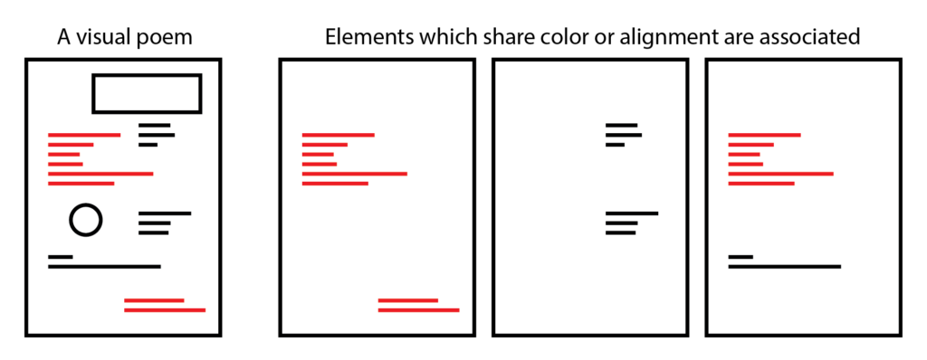 |
| Proximity | 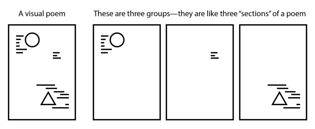 |
| Symmetry | 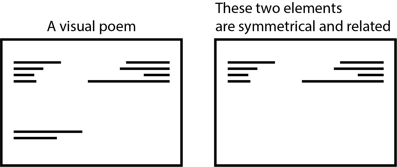 |
These are just a few of the ways we order visual information. But what does “Gestalt grouping” mean? In psychology, the Gestalt principles are a set of observations first developed in Germany in the 1920s. Bauhaus (and therefore all contemporary graphic design) was heavily influenced by these ideas.
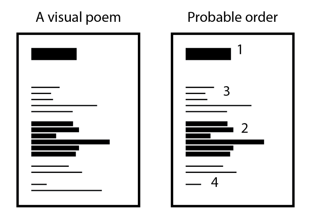
Hierarchy is a related idea, and it is a big part of graphic design. As above, elements in a poem are grouped by visual similarities, but now, take into account the “intensity” of each group in order to signal the relative importance of the text, or to signal its reading order. I am using the word intensity as a catch-all term for what seems to jump out the most to you as a reader/viewer. Very large text is more intense than very small text. Bright colors are more intense than dull ones. Is a small bright word more intense than a large dull one? It is like deciding if a shirt is too casual for an event. First, go with your intuition, then ask what others think.
Further Examples:
- Eugen Gomringer – do you think, 2005 (Silkscreen)
- Mai Der Vang – “Composition 1” (Poem from Yellow Rain)
- Cynthia Dewi Oka – “Ma: A Multidisciplinary State” (Poem)
- Anthony Cody – Borderland Apocrypha (Book)
- Anuradha Bhowmik – “Receipts from AOL Instant Messenger (4)” (from Brown Girl Chromatography)
The Lyric Image I: Association
“I love the freedom that is created when the text and the image are in juxtaposition—that it creates a kind of associative field that I can’t control.” -Claudia Rankine
Many lyric poems operate through associative leaps, with no explicit logic linking lines together. Instead, they are linked together by the interiority of the speaker of the poem. Ideas in a lyric poem are often not driven by narrative or by cause and effect, but by thematic or emotional resonance:
Whirl up, sea—
whirl your pointed pines,
splash your great pines
on our rocks,
hurl your green over us,
cover us with your pools of fir.
H.D. – Oread (1913–14)
It can be difficult to describe what a lyric poem is “about,” because unlike a novel, which has a story, or an essay, which has an argument, a lyric poem is often a set of uncertainties (what does the poet mean by this?) that evoke something in the reader.
Therefore, much of the power of a lyric poem happens between the lines, in what is not said—in what is felt, understood, or guessed at by the reader based on possibilities expressed in the poem. Visual poems can do this as well, but they can also create these lyric leaps through the friction between lines and images:
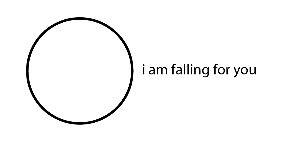
Is the circle mimetic—does it represent a hole, thereby illustrating “falling” in love? Or is it meant to evoke a cycle—that the speaker keeps falling in love for someone over and over again? Maybe the circle is the moon, and like Li Bai, the speaker is in love with it.
Poems—all poems, from visual to non-visual to everything in between and beyond—are best served by careful reading, and by multiple readings, and by considering what might be being said, while testing it against other things that poem is saying and doing.
Further Examples:
- Roda Avelar – “Jotxland Epic” (Poem)
- Rebecca Cross – “The Transgressive Body in Film” (Poem)
- CAConrad – “Golden in the Morning Crane Our Necks” (Poem)
- Juan Felipe Herrera – “Exile Boulevard” (Poem)
- Carolina Ebeid – Video poems (See: https://carolinaebeid.com/)
The Lyric Image II: Guided Interpretation
“What I cannot express, I point out with my finger.” -“On Vanity,” Montaigne
In a traditional poem, a title can serve as an interpretive catalyst. A partial list of things a title can do:
- set the tone – “Don’t Let Me Be Lonely” by Claudia Rankine
- give a context – “Harlem” by Langston Hughes—note how the title informs the dream deferred
- give a referent – The Sound and the Fury by William Faulkner—title refers to a line from Macbeth
- foreshadow – The Tragedy of Macbeth by William Shakespeare
- enigmatize – “The Emperor of Ice-Cream” by Wallace Stevens
- polysemize (to introduce multiple possible readings) – Rent by Jonathan Larson
A visual poem (which of course can have a title too) can do all of the above with its images. “Amazing Grace” by John Newton sets a tone with its title, and a visual poem can set a tone with glitter. Lewis Carrol’s “Jabberwocky” has a mysterious title, and finishing the poem, one might not fully know what exactly a jabberwocky is. So too can a visual poem introduce images that remain just beyond the reader’s reach.
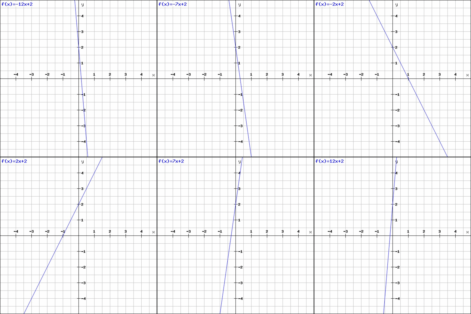
Let’s think about images that act as referents. An image can get the reader to think about something the text never directly asks the reader to engage with. A poem might be about family, but the images include graphs. In poems like those in Monica Ong’s Silent Anatomies, the great contrast between the emotional vulnerability of a love poem and the cold objective minimalism of a graph creates a kind of foil (a contrast used to intensify or highlight a message or character).
Further Examples:
- Vanessa Angélica Villarreal – “Crossover Album” (Poem from Beast Meridian)
- Evie Shockley – “truth in advertising” (Poem from semiautomatic)
- Jade Yeung – “Portrait of Trauma as Lite-Brite (in which “I” is any child), ages 0+” (Poem)
- Boderra Joe – “Return to Sender” (Poem from Desert Teeth)
- féi iká shumarí – “On June 2024 Usú Buys a 3 Year Storage Space For Her Future Grandchildren at a Fertility Center Because Her Trans Daughter is Undergoing a Medical Transition, is Mentally Unstable, and Can’t Afford to Preserve Her Will To Experience Motherhood Someday, Somehow” (Poem)
Performance
“I got introduced to poetry via the stage, where there isn’t a place to crawl behind the language.” –Patricia Smith
The word lyric shares it etymology with lyre, because in ancient Greece, poems were sung to the music of the lyre. The singing of poetry has deep roots in Arabic, Persian, and Turkish traditions. Poems in China were traditionally sung or chanted. Griots in West Africa sang poems with musical accompaniment. Poetry is deeply tied to performance, and many of the most popular forms of contemporary poetry exist primarily to be read aloud (see: slam poetry/spoken word).
A visual poem might be thought of as sheet music designed specifically for words. In that case, one could interpret space in terms of pacing, or typeface in terms of voice. Color or texture, or other visual elements like shapes, illustrations, or photos might be expressive cues for the reader’s body language, facial expressions, or vocal tone, or to indicate staging decisions. How might a poem encourage the co-occurrence of one reader’s voice with dance, music, or other readers? What parts of communication are usually lost in words alone? This can be an alluring way to interpret visual poetry, though it has its own set of challenges. For instance, how do you resolve poems with no defined order of text?
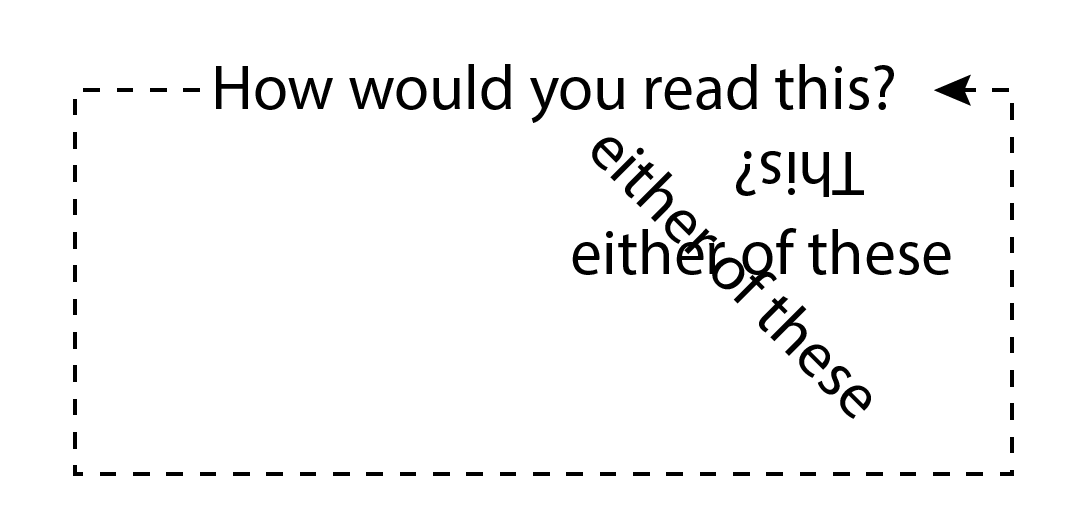
Try the strategies outlined in Reading Order. Afterward, look up the poet, or poem, and see if the poet has performed the piece. See if you can find the same poem performed on a different date—is it the same performance? (Douglas Kearney is a great poet for this exercise.)
But all of this is only one model—one of many potential ways to understand or reinterpret a visual poem. Another model is: What if the visual poem itself is a record of a performance of a set of feelings or ideas? What if we think of the visual poem as capturing lightning in a bottle, of sketching a butterfly caught in the wind, or as the equivalent of recording a live band? In those cases, a performance is impossible or perhaps besides the point.
Furthermore, what if we consider the visual poem as “unreadable”? Some or all of the piece might literally be impossible to read aloud. In theater, the closet drama is an example of a form of “performance” never meant to be performed except in the reader’s head. Asemic writing is illegible text that nevertheless evokes some of the qualities of language (See Renee Gladman’s Prose Architectures).
Further Examples:
- Yoko Ono – Grapefruit (Book)
- John Cage – “Water Walk” (Score for performance)
- Shayla Lawz – speculation, n. (Book, with QR Codes)
- Chaun Webster – “forbidDIN” (Poem from GeNtry!fication: Or the Scene of the Crime)
- Kenji C. Liu – “Manifest Destiny for Sassy Choir” (Poem from Monsters I Have Been)
Case Study: “Uncanny Emmett Till” by Keith S. Wilson
Making a Visual Poem
“All visual writing is a rejection of, by which I mean an expansion of, regular writing.” –The Last Vispo Anthology: Visual Poetry, 1988-2008, Jim Leftwich
Even if you don’t consider yourself an artist or writer, the act of creating gives you new avenues for understanding poetry and art. But unlike traditional poetry, which has a very low barrier of entry for those inspired by what they read, visual poetry often introduces significant technical barriers to its creation.
My first tip is to try to start with what you already know: If you love taking photos, use your phone or camera for your images. If you know how to use Microsoft Word, or Google Slides, or some other program or app, try that. Get started.

Visual poems also don’t necessarily require as much technology as it may at first seem. Try creating by hand. Paint, or cut up paper, or draw in the sand. If you want to share your poems, you’ll need to take a photo or scan what you create, but you don’t need to work entirely in a program in order to create a visual poem. For examples and inspiration, look at Naoko Fujimoto’s Glyph: Graphic Poetry (mixed media and paintings), Anne Carson’s Nox (photographs of personal ephemera), Susan Howe’s That This (collage and photocopies), and Krista Franklin’s Under the Knife (photography, mixed media, and book arts).
Here is a list of other resources:
Programs to Create Visual Poems – Low Learning Curve
These programs/apps/websites are fairly quick to learn. They are often free or cheap, and there are lots of tutorials on YouTube, LinkedIn, and at your local library because these programs tend to be used in corporate environments.
- Google Slides
- Microsoft PowerPoint
- Canva
- Figma
Programs to Create Visual Poems – High Learning Curve
If you already have a lot of experience with visual art, or if you have very specific things you are trying to do, you might need a software program with a lot of features. These programs often take much longer to learn, though keep in mind you only need to learn the parts that apply to your specific practice.
- Adobe Illustrator – Good for a mix of words and images or drawings
- Inkscape – Free alternative to Illustrator
- Adobe Photoshop – Good for very image/photo-heavy poems. Text is difficult to edit in Photoshop
- Gimp – Free alternative to Photoshop
- Adobe InDesign – Good for very text-heavy poems. Images are harder to work with
Resources for Images to Work With
Be sure to investigate the rights to any images you use.
- Public Work by Cosmos – Search engine for public domain images
- Wikimedia Commons – Includes public domain images
- Library of Congress Digital Collections – Historical documents and images
- Biodiversity Heritage Library – Scientific drawings
- NASA Images – Photos of space
FAQ
Q: Are visual poems inaccessible?
A: They are and they aren’t.
Accessibility as a field of study is concerned with making more things usable by people with disabilities. There are resources for learning about methods for accessibility in poems that require seeing (or seeing colors)—from using larger font sizes, to creating alt text (assistive text that accompanies digital images for readers with visual impairments). An excellent resource on alt text is the Alt Text as Poetry project. Creating a version of your work that allows disabled people to experience it is an act of translation, with all the opportunities and challenges that come with any translation.
“Accessibility” can also refer to general comprehensibility by a large audience. Since visual poetry is a very diverse and a comparatively young tradition (compared to something like the Epic of Gilgamesh which is is over 4000 years old!), many people will have trouble knowing where to start. That’s why this document exists! But what is inaccessible to one person is accessible to another—for some, poetry itself is difficult to understand, and visual poetry is a way in.
If you are interested in more people “getting” your work, the best strategy is to read widely (see how others approach the challenge), and to share your work with others and listen to what they understand and what they have trouble with. All forms of speaking are negotiations between what you mean to say and what you do say. You can’t close that gap without starting a conversation.
Q. What is the difference between visual poems, hybrid poems, and experimental poems?
A. The nature of definition always drifts into the prescriptive—telling people what they should call things. I resist this when I can. I mean to define a thing only to make talking about it easier. When a definition fails at that, I am happy to leave it behind. Here are some ways I think about each term:
Visual poems – As I mention in the introduction, I think of visual poems as containing visual elements that are especially important to the poem. Line breaks are visual elements. If a poem is terribly diminished by removing all the line breaks, I might call that a visual poem, even if it contains no pictures, diagrams, etc.
Experimental poems – To paraphrase Douglas Kearney, I think of experimental poetry as a practice, not a poem. Nothing can be experimental without pushing off of something that is NOT experimental, and what is experimental differs wildly from community to community and from culture to culture. It usually only feels worthwhile to me to consider what is experimental to my own practice—to my own sensibilities.
Hybrid poems – I think of hybrid work as encompassing more than one form or tradition. It’s all very subjective!
If you are interested in these terms because you are hoping to send poetry to a journal looking for “hybrid work,” or want to buy a book on “experimental poetry,” you’ll have to investigate the community using those words to see what they mean.
Q. When I try to make my own visual poems, how do I choose a visual that isn’t literal?
A. There isn’t anything inherently wrong with the literal (or direct) use of images—concrete poems and poems that include direct illustrations are examples where the direct image might be appropriate (see: “hogtied” by José Felipe Alvergue from scenery). But if you are interested in the lyric image as I describe in Lyric Image I and Lyric Image II, here are some strategies:
The first is to choose or create an image that only represents one quality of an idea you want to write about. For instance, describing a race with a racetrack is very direct, but describing the love life of a runner using a racetrack gives you opportunities to surprise the reader and yourself. Another strategy is to write the poem first and try adapting it to images or drawings afterward. Again, you may surprise yourself with the connections you make. It might help, as well, to investigate resources and strategies from totally outside any field of writing. There are visual poets who have dedicated their lives to expression through movement, color, sound, light, and other nonverbal means. These can be fruitful spaces to investigate creating nonliteral work.
Image Sources
All images created by Keith S. Wilson except where follows:
Image: “Gradient of a line in coordinates from -12x+2 to +12x+2.gif”
by Alborzagros via Wikimedia Commons,
CC BY-SA 3.0
(Altered by Keith S. Wilson) Leonardo da Vinci, The Last Supper, via Wikimedia Commons, public domain, sourced from the original mural at Santa Maria delle Grazie, Milan.
Cover of Nox by Anne Carson (New Directions, 2010).
Download as a PDF
If you would like to print this resource for teaching or reading, choose from below.
| Full Packet |
|---|
| Full Packet (27 Pages) |